A birthday photo book can contain beautiful photographs and still look unprofessional if the pages lack structure.
Professional-looking photo books are not necessarily complicated. In most cases, the difference comes down to spacing, alignment, consistency, typography, image selection, and visual hierarchy.
If your birthday photo book feels crowded or inconsistent, these layout principles can help.
What Makes a Birthday Photo Book Layout Look Professional?
A professional layout usually has:
- Clear visual hierarchy
- Consistent margins
- Good image quality
- Balanced spacing
- Controlled typography
- Consistent colors
- Purposeful photograph placement
- Enough whitespace
- Variation between pages
The goal is not to make every page identical.
The goal is to make every page feel like it belongs to the same book.
1. Give Important Photos More Space
If a photograph is particularly meaningful, do not hide it among eight smaller photographs.
Give it room.
A full-page or large two-page layout can make an important photograph feel more significant.
2. Use a Consistent Margin
Choose a margin and maintain it.
When photographs sit at slightly different distances from the edge on every page, the entire book can feel untidy.
3. Establish a Visual Hierarchy
Not every element should compete for attention.
A page might have:
Main photograph → headline → caption
rather than five photographs, three fonts, decorative elements, and multiple competing headlines.
4. Avoid Filling Every Empty Space
Whitespace is not wasted space.
Empty areas help photographs and text stand out.
If a page feels crowded, removing something may improve it more than adding another decorative element.
5. Limit Your Fonts
Two fonts are usually enough.
For example:
Display font: birthday titles and headings
Simple font: captions and supporting text
Using five or six unrelated fonts can make a photo book look inconsistent.
6. Align Your Elements
Choose a consistent alignment system.
You can align:
- Photograph edges
- Headings
- Captions
- Page numbers
- Decorative elements
A simple grid makes this easier.
7. Create Different Page Rhythms
A professional book does not repeat the same layout 30 times.
Instead, alternate:
Full image → collage → text → two-image spread → grid → full image
This creates rhythm.
8. Use Color Carefully
If the photographs are colorful, a restrained background can prevent the pages from becoming overwhelming.
If the photographs are mostly neutral, a subtle accent color can add personality.
Choose a small palette and repeat it.
9. Keep Captions Close to Their Photos
A caption should visually belong to the photograph it describes.
Do not place text so far away that the reader cannot tell which photograph it refers to.
10. Use Cropping Intentionally
Do not crop faces, hands, or important objects accidentally.
Before placing a photograph into a layout, identify the part of the image that matters most.
11. Avoid Stretching Photographs
Always preserve the original aspect ratio.
Stretching a photograph horizontally or vertically immediately makes a design look amateur.
12. Use Full-Bleed Pages Carefully
A full-bleed image extends to the edges of the page.
It can create a dramatic result, especially for:
- Portraits
- Landscapes
- Travel photographs
- Family photographs
But not every photograph works well as a full-bleed image.
13. Pair Photographs That Belong Together
Two photographs on one spread should have a reason to appear together.
They could show:
- The same event
- Before and after
- Two people
- Two locations
- Two different moments from the same day
14. Use Repetition Without Copying
Repeating certain design elements creates consistency.
For example, you could repeat:
- A small date treatment
- One accent color
- A particular heading style
- Page numbering
- A subtle frame
This creates a recognizable visual language.
15. Create a Strong Cover
The cover should establish the visual direction of the album.
Use one strong photograph rather than trying to show every memory at once.
A Professional 30-Page Layout Structure
One possible structure is:
| Section | Layout approach |
|---|---|
| Cover | One strong image |
| Introduction | Photograph + short message |
| Childhood | Small photo grid |
| Family | Two-image spreads |
| Friends | Collage |
| Travel | Full-bleed images |
| Milestones | Timeline |
| Everyday moments | Casual grid |
| Birthday | Hero photograph |
| Messages | Text-focused |
| Final section | Large photograph + letter |
Common Layout Mistakes
Too Many Photographs
More photographs can reduce the impact of the strongest images.
Too Many Fonts
Typography should support the photographs, not compete with them.
Inconsistent Spacing
Small spacing differences become noticeable when repeated across many pages.
No Visual Hierarchy
If everything is large and bold, nothing feels important.
Overdecorating
Stickers, frames, shapes, and illustrations should support the memory rather than cover it.
Should You Design Every Page From Scratch?
Not necessarily.
A professionally designed template can give you a consistent grid, typography system, and visual direction while allowing you to focus on your photographs.
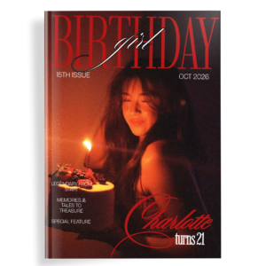
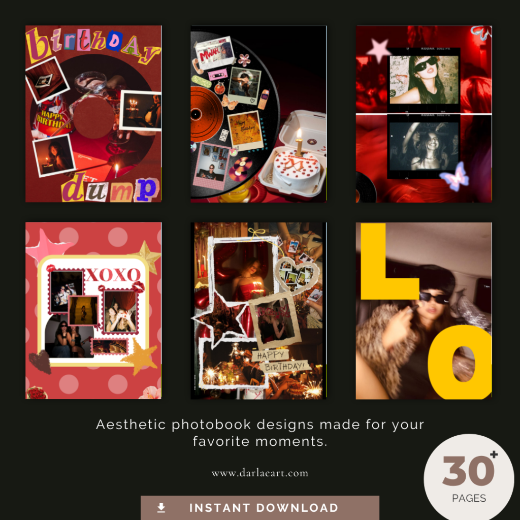
Darlae’s Aesthetic Birthday Photo Book is designed as a 32-page Canva birthday template with a modern visual direction. Aesthetic Birthday Photo Book – Darlae
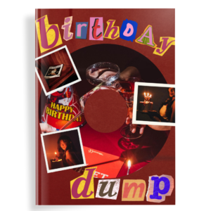
For a more decorative approach, the Scrapbook Birthday Photobook uses layered scrapbook-inspired visual elements that can be useful when your album contains many different types of memories. https://darlaeart.com/product/scrapbook-birthday-photobook/
A Simple Test for Every Page
Before finalizing a page, ask:
What do I notice first?
If the answer is unclear, simplify the page.
Then ask:
Does every element need to be here?
If removing something makes the page stronger, remove it.
Finally:
Does this page look like it belongs to the same book as the previous page?
If yes, your visual system is working.
Frequently Asked Questions
How do I make a photo book look professional?
Use consistent spacing, typography, image quality, alignment, colors, and visual hierarchy. Give important photographs enough space and avoid overcrowding.
How many photos should go on one page?
One to five photographs works well for many layouts, although collage pages can contain more.
What is the best layout for a birthday photo book?
There is no single best layout. A combination of full-page photographs, grids, collages, text pages, and two-image spreads usually creates better visual rhythm.
Should every page have the same design?
No. Consistency is important, but repeating exactly the same layout can make the album feel monotonous.
Can a Canva template make a photo book look professional?
Yes. A well-designed template can provide consistent typography, spacing, grids, and page structures that would otherwise need to be created manually.
Tags: birthday photo book layout, photo book layout ideas, professional photo book design, birthday album layout, Canva photo book, birthday scrapbook layout, photo album design